Subjects
Grades
One of the uses of a scatter plot is to predict future results. To quantify the accuracy of these estimates, we calculate the linear correlation coefficient.
The linear correlation coefficient, generally denoted by |r|, quantifies the strength of the linear relationship between the two variables of a distribution. It can be determined by estimating from a graph or by using a mathematical formula.
The correlation coefficient will always have a value in the interval [|-1|, |1|].
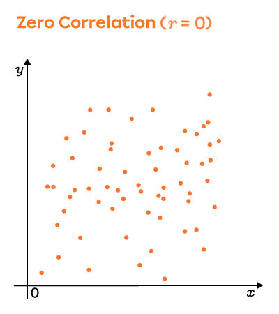
The linear correlation coefficient of a distribution gives an idea of how the scatter plot looks, and vice versa. First off, the sign of the coefficient, positive or negative, indicates the direction of the slope of the regression line. To understand the correlation coefficient, here are three scatter plots that illustrate the extreme values, namely, |-1|, |0| and |1|.
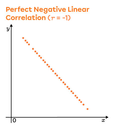
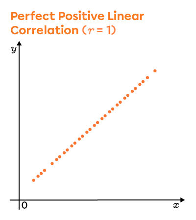
In other words, the closer the value of the linear correlation coefficient is to |1| or |-1|, the stronger the linear relationship between the two variables.
Conversely, the closer the value is to |0|, the weaker the linear relationship between the two variables.

Moments in the video :
To calculate the values of |r|, use a graph or calculate the value with a formula. On the other hand, to simply compare the linearity of a graph to another, just take a look at the scatter plot and the alignment of the points.
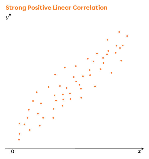
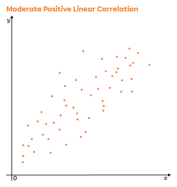
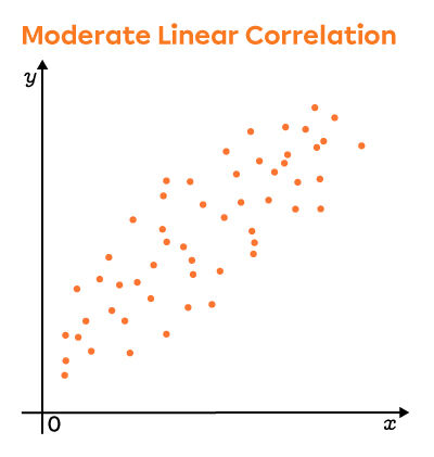
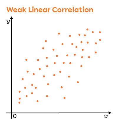
Looking closely at these graphs, the points are more dispersed in the second scatter plot. Thus, the linear correlation coefficient is lower in this plot than in the first.
The difference between correlation coefficients can be seen clearly in the following scatter plots.

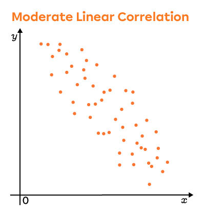
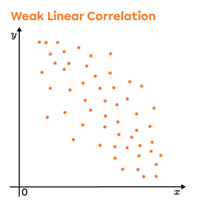
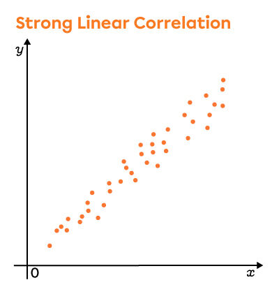
Depending on the value of the correlation coefficient, we see that the points of scatter plot become increasingly dispersed. On the other hand, it is always possible to find the direction of the scatter plot (positive or negative). When the points are so widely dispersed that it becomes impossible to determine their direction, the linear correlation coefficient is zero.
To simplify the visual representation of the collected data, the data is sometimes grouped into classes and placed in a double entry (two-variable) table.
To go from a scatter plot to a double entry (two-variable) table, segment the scatter plot in order to clearly define each of the classes.
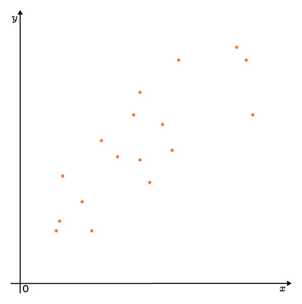
So, this scatter plot...
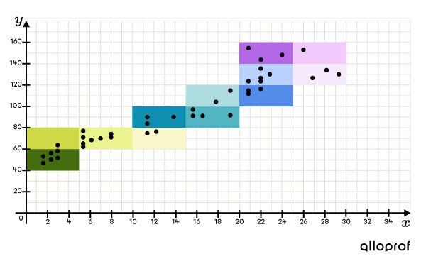
... becomes the following double entry (two-variable) table.
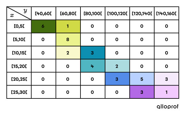
Once this table is obtained, it is possible to predict the correlation of the data.
According to the previous double entry (two-variable) table, the correlation is strong and positive.
It is positive, because the more the data increases in |x|, the more the data increases in |y|.
It is strong because the data is grouped near the diagonal of the double-entry table.
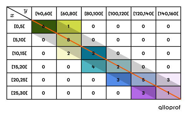
Note: if the data clusters around the other diagonal, i.e., the diagonal that starts at the bottom left and ends at the top right, then the correlation will be negative.
By determining more precisely the value of the linear correlation coefficient, it is easier to quantify the correlation between two variables.
||r\approx\pm\left(1-\dfrac{w}{L}\right)||where
|L\!:| the length of the rectangle outlining the scatter plot
|w\!:| the width of the rectangle outlining the scatter plot
As for the sign of |r|, it is determined according to the direction of the scatter plot.
In general, this formula makes it possible to find a value that is fairly representative of the linear correlation coefficient. On the other hand, there are more sophisticated tools which accurately calculate this value.
Generally, the following values will be used to qualify the linear correlation.
|
Value of |r| |
Strength of the linear relationship |
|---|---|
|
Close to |0| |
None |
|
Near |\pm\, 0{.}50| |
Weak |
|
Near |\pm\, 0{.}75| |
Moderate |
|
Near |\pm\, 0{.}87| |
Strong |
|
Near |\pm\, 1| |
Very strong |
|
|\pm\, 1| |
Perfect |
To associate a numerical value with the correlation coefficient, follow these 3 steps.
Draw the scatter plot.
Draw a rectangle and measure its length and width.
Calculate the correlation coefficient using the formula.
Draw the scatter plot
By placing each of the points in a Cartesian plane, the following scatter plot is obtained.
Draw a rectangle and measure its length and width
The rectangle must contain each point and be as small as possible. When tracing the rectangle, use a set square and measure the segments.
Since there are no outliers or abnormal data, the following rectangle is obtained.
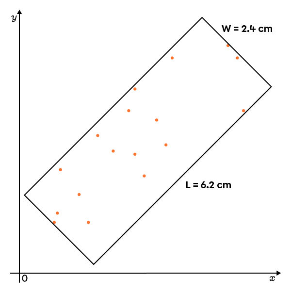
Calculate the correlation coefficient using the formula
|r \approx \pm \left(1 - \dfrac{2.4}{6.2} \right)|
|r \approx \pm 0{.}61|
|r \approx 0{.}61|, since the scatter plot is positive.

Moments in the video :
With graphing calculators or software such as spreadsheets, a much more precise correlation coefficient can be obtained. Just enter all the data in a table of values, select the correct function, and let the software do the calculations.
The formula for precisely calculating the linear correlation coefficient |r|, is the following. ||r=\dfrac{\sum\left(x-\overline{x}\right)\left(y-\overline{y}\right)}{\sqrt{\sum\left(x-\overline{x}\right)^{2}}\sqrt{\sum\left(y-\overline{y}\right)^{2}}}||
where
|x\!:| a value in the first distribution
|\overline{x}\!:| the mean of the first distribution
|y\!:| a value in the second distribution
|\overline{y}\!:| the mean of the second distribution
|\sum\!:| symbol that signifies the sum of...