Subjects
Grades
A correlation describes the type, variation, and strength of a relationship between 2 quantitative variables in a distribution.
In a scatter plot, each point represents a pair of values from the 2 measured variables. The correlation is visible from the overall shape of the scatter plot. For example, if the points appear aligned, it indicates a strong linear correlation. If the points are randomly dispersed all over, it indicates a weak correlation or even no correlation at all.
A linear regression line (or line of best fit) can be superimposed on the scatter plot to visualize the trend of the correlation. The linear regression line is a line that passes as close as possible to the points and allows us to predict the value of one variable as a function of the value of the other one.
There are 2 types of correlation: positive correlation and negative correlation.
A positive correlation indicates that the 2 variables move in the same direction, that is, when one variable increases, the other variable also increases, and vice versa.
A negative correlation indicates that the 2 variables move in opposite directions, in other words when one variable increases, the other decreases.
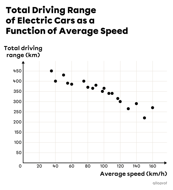
As a car's average speed increases, its total driving range decreases.
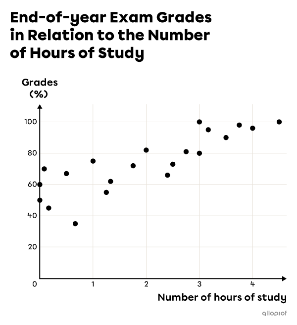
In general, as the time spent studying for an exam increases, the grade obtained also increases.
The most commonly used measure for calculating correlation strength is the linear correlation coefficient, denoted |r.| This value can be any number between |-1| and |1.|
An |r| value equal to |1| indicates a perfect positive correlation.
An |r| value equal to |-1| indicates a perfect negative correlation.
An |r| value equal to |0| indicates that there is no correlation between the 2 variables.
A number of methods can be used to calculate the value of this coefficient.
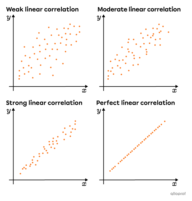
Here are scatter plots that show an increasingly strong positive linear correlation.
It is important to note that correlation does not determine causation between 2 variables. It simply measures the strength of the relationship between them. So a high correlation between 2 variables does not necessarily mean that a change in one is the direct cause of a change in the other.
Antoine is having some difficulty at school. He spent an increasing number of hours studying for his last 4 history exams. Yet his marks have decreased from one evaluation to the next. There is therefore a negative correlation between the number of hours he spends studying and his grades. Should Antoine conclude from this that his studying is causing his grades to slip and therefore he should study less?
Answer: No! His declining grades may be caused by a number of other factors. For example, he may have been increasingly absent from class. If he's been absent from many history lessons, he's missing out on essential information he needs to succeed. So, for Antoine, studying a lot without having seen all the material doesn’t help him. It's also possible that he's spending more hours studying, but that he is exposed to more distractions than in the past. As a result, his study time, even though it is longer, is less effective.
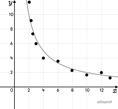
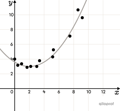
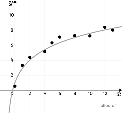
The correlation between 2 variables is not always linear.
Non-linear correlation describes a correlation in which the relationship between variables cannot be represented by a straight line.
To identify a non-linear correlation, it is useful to visualize the data using a scatter plot. The shape of the scatter plot must be associated with the mathematical model that most closely resembles it.
Here are a few examples of scatter plots where a non-linear correlation between variables can be observed. There are many others.