Subjects
Grades
In statistics, graphs are very useful for looking at how data is distributed.
A bar graph is used to represent observed frequencies. It can represent both qualitative data and discrete quantitative data. The characteristics of the bar graph are the following:
Each bar is associated with a value and a category.
The length of the bar is proportional to its frequency.
The distance between each bar must be the same and the first bar must not be directly attached to the parallel axis.
The width of the bars should be uniform.
The graph should have a title and the axes should be labelled with what they represent.
The bars can be vertical or horizontal.
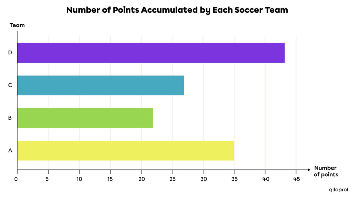
Here is a table of values, along with a horizontal bar graph, representing the number of points accumulated during the soccer season by four different teams.
|
Soccer teams |
A |
B |
C |
D |
|---|---|---|---|---|
|
Number of points accumulated |
|35| |
|22| |
|27| |
|43| |
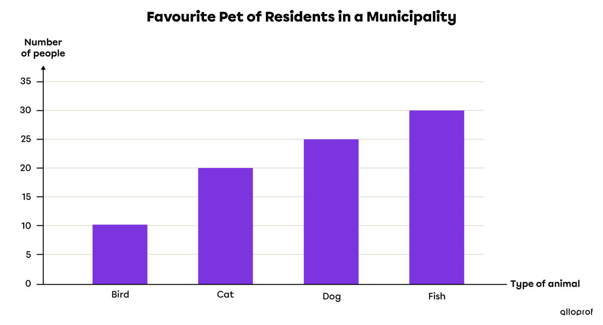
The same rules must be followed with vertical bar graphs. Essentially, only the orientation of the bars will be different.
A survey was conducted to determine the favourite pet of the residents in a municipality. Here is a table of values and a vertical bar graph displaying the results.
|
Favourite Pet |
Bird |
Cat |
Dog |
Fish |
|---|---|---|---|---|
|
Number of people |
|10| |
|20| |
|25| |
|30| |
The broken-line graph is used to show discrete quantitative and continuous quantitative data that changes over time. The characteristics of the broken-line graph are the following:
Each point is plotted according to the |x|- and |y|-axis.
Usually, this kind of graph represents a situation that changes over time (years, months, days, etc.).
Starting from the first point, connect each consecutive point using straight lines.
The graph must have a title and the axes must be labelled with what they represent.
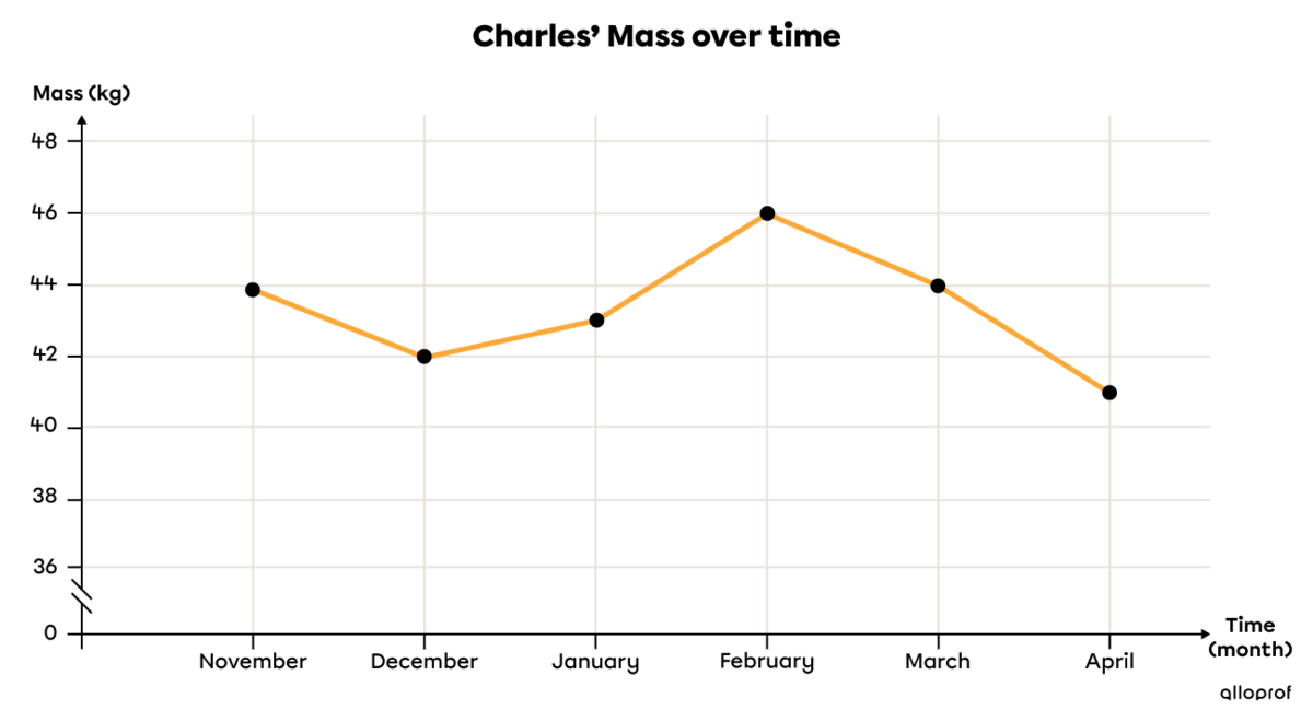
This winter, Charles, a middle school student, experienced serious health problems. His mass fluctuation is shown in a table of values and a broken-line graph.
|
Month |
Nov. |
Dec. |
Jan. |
Feb. |
Mar. |
Apr. |
|---|---|---|---|---|---|---|
|
Mass (kg) |
|44| |
|42| |
|43| |
|46| |
|44| |
|41| |
Frequencies can also be represented in the form of pictographs. In contrast to other diagrams, these consist of drawings that are associated with quantities.
On a beautiful summer evening, Marie and Simon count all the stars they see. Marie sees |65,| while Simon sees |70.| The situation can be represented as follows.
|
Number of stars observed by Marie |
 |
|---|---|
|
Number of stars observed by Simon |
 |
Legend: each star in the pictograph represents |10| stars.
Interpreting pictographs requires first reading and understanding the legend. In this case, a star represents |10| real stars. From this, it can also be deduced that a half-star represents half of |10| stars, which is |5| stars.
In the pictograph above, there are |6.5| stars, which correspond to the |65| stars observed by Mary.
The pie chart is useful for showing a whole divided into parts. It is used to represent qualitative data. The characteristics of a pie chart are the following:
Each circle sector is linked to a category that is usually presented as a percentage.
The central angle of each section of the circle represents the proportion of a category with respect to the whole |(360^\circ).|
There must be a title and a legend describing the category of each section.
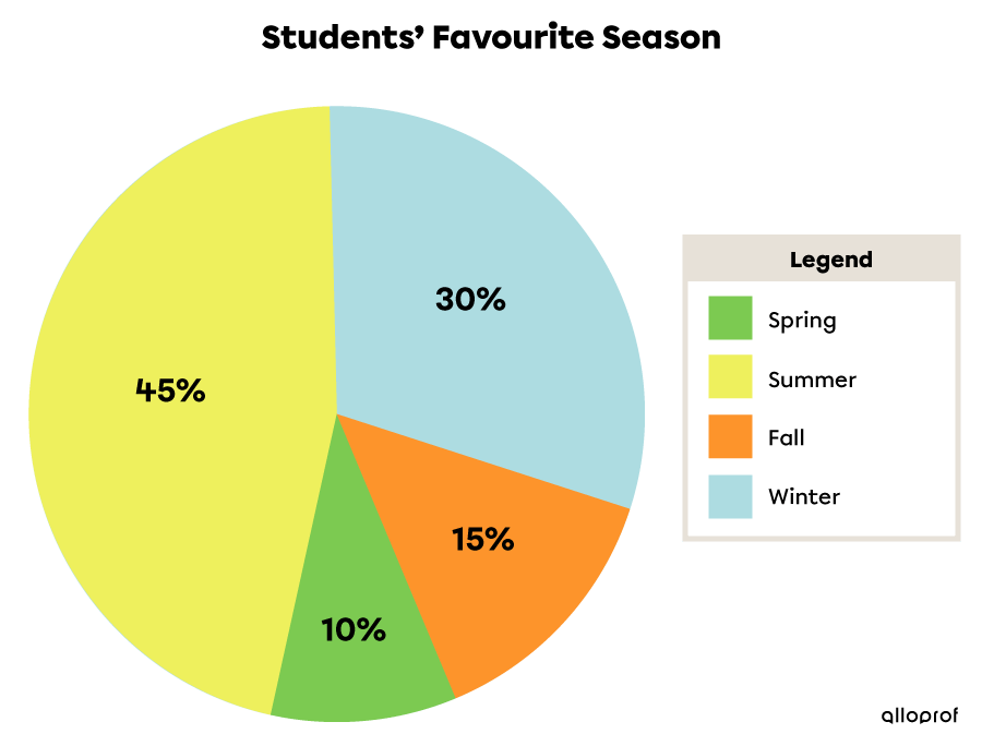
|160| high school students are asked which season is their favourite. Here is the frequency table illustrating the results.
|
Season |
Students |
Relative frequency |(\%)| |
Central angle |(^\circ)| |
|---|---|---|---|
|
Winter |
|48| |
|30| |
|108| |
|
Fall |
|24| |
|15| |
|54| |
|
Spring |
|16| |
|10| |
|36| |
|
Summer |
|72| |
|45| |
|162| |
|
Total |
|160| |
|100| |
|360| |
The relative frequency of a data value can be calculated using the following proportion.||\dfrac{\text{Relative frequency}}{100}=\dfrac{\text{Frequency}}{\text{Total frequency}}||The central angle can be calculated using one of the 2 following proportions.
||\dfrac{\text{Central angle of a section}}{360^\circ}=\dfrac{\text{Frequency}}{\text{Total frequency}}||
||\dfrac{\text{Central angle of a section}}{360^\circ}=\dfrac{\text{Relative frequency}}{100}||
Since the pie chart is made by drawing a circle, we can use certain properties of the circle to find missing quantities.
Here is the incomplete data table of a pie chart.
|
Season |
Students |
Relative frequency |(\%)| |
Central angle |(^\circ)| |
|---|---|---|---|
|
Winter |
|48| |
|30| |
|108| |
|
Fall |
|
|
|
|
Spring |
|16| |
|
|36| |
|
Summer |
|
|45| |
|
|
Total |
|
|100| |
|360| |
To find the value of the green box, use the following proportion.||\begin{align}\dfrac{30}{15}&=\dfrac{108}{\color{#3a9a38}{\text{green box}}}\\\\\color{#3a9a38}{\text{green box}}&=15\times108\div30\\&=54\end{align}||