Subjects
Grades
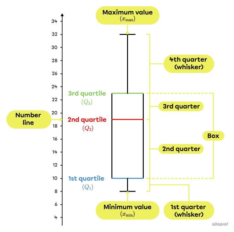
The box and whisker plot allows you to see, at a glance, several details about the dispersion of the data in a distribution. It shows the quartiles (including the median), the minimum value, the maximum value, the interquartile range, the quarter range, and the outliers. In addition, the box and whisker plot makes it easy to assess the symmetry (or asymmetry) of a distribution.
A box and whisker plot is usually placed horizontally, but it is also possible for it to be placed vertically. Here is an example of each type.

It is possible for a distribution to contain some outliers, that is, data that are not representative of the rest of the distribution. If such data values exist, make sure that they are indicated in the quartile diagram. They cannot simply be eliminated, otherwise the graph would be misleading and lose its credibility.
An outlier is a value in the distribution that is less than |1.5| times the interquartile range from |Q_1| or greater than |1.5| times the interquartile range from |Q_3.|
In other words, a data value |x| of a distribution is an outlier if one of the following two conditions is met:
|x<Q_1-1.5\times IR|
|x>Q_3+1.5\times IR|
Here are the steps to follow to construct a box and whisker plot:
Place the data in ascending order.
Separate the data distribution into |4| equal quarters.
Determine the value of the quartiles.
Determine if there are any outliers.
Determine the minimum and maximum.
Draw the box and whisker plot.
Draw the box and whisker plot for the following distribution:
|15,| |26,| |31,| |16,| |19,| |38,| |12,| |22,| |36,| |27,| |30,| |18,| |29|
Place the data in ascending order
|12,| |15,| |16,| |18,| |19,| |22,| |26,| |27,| |29,| |30,| |31,| |36,| |38|
Separate the data distribution into |\boldsymbol{4}| equal quarters
This distribution has an odd number of data values |(13).| Therefore, |Q_2| is the data value at the centre of the distribution and separates it into |2| subgroups of |6| data values. |Q_1| and |Q_3| are therefore between data values, in order to create |4| quarters that each contain |3| data.
||\begin{alignat}{20}&&&\boldsymbol{\color{#ec0000}{\underbrace{Q_2}}}\\12,15,16\ &\color{#3b87cd}{\Big\vert}\ 18,19,22\ &&\color{#ec0000}{\boxed{\boldsymbol{26}}}\ 27,29,30\ &&\color{#7cca51}{\Big\vert}\ 31,36,38\\&\!\!\!\!\boldsymbol{\color{#3b87cd}{\overbrace{Q_1}}}&&&&\!\!\!\!\boldsymbol{\color{#7cca51}{\overbrace{Q_3}}}\end{alignat}||
Determine the value of the quartiles
We start by determining the value of the median |(Q_2),| which corresponds to the 7th data value.
||\boldsymbol{\color{#ec0000}{Q_2}}=\boldsymbol{\color{#ec0000}{26}}||
Then the 1st quartile |(Q_1)|, which corresponds to the middle of the 3rd and 4th data values, is calculated by finding the mean of those two data values.
||\begin{alignat}{20}12,15,\boldsymbol{16}\ &\color{#3b87cd}{\Big\vert}\ \boldsymbol{18},19,22\ &&\color{#ec0000}{\boxed{\boldsymbol{26}}}\ 27,29,30\ &&\color{#7cca51}{\Big\vert}\ 31,36,38\\&\!\!\!\!\boldsymbol{\color{#3b87cd}{\overbrace{Q_1}}}\end{alignat}||||\boldsymbol{\color{#3b87cd}{Q_1}}=\dfrac{16+18}{2}=\boldsymbol{\color{#3b87cd}{17}}||
Finally, the 3rd quartile |(Q_3),| which corresponds to the mean of the 10th and 11th data values, is calculated.
||\begin{alignat}{20}12,15,16\ &\color{#3b87cd}{\Big\vert}\ 18,19,22\ &&\color{#ec0000}{\boxed{\boldsymbol{26}}}\ 27,29,\boldsymbol{30}\ &&\color{#7cca51}{\Big\vert}\ \boldsymbol{31},36,38\\&&&&&\!\!\!\!\boldsymbol{\color{#7cca51}{\overbrace{Q_3}}}\end{alignat}||||\boldsymbol{\color{#7cca51}{Q_3}}=\dfrac{30+31}{2}=\boldsymbol{\color{#7cca51}{30.5}}||
Determine if there are any outliers
First, the interquartile range is calculated.
||\begin{align}IR&=Q_3-Q_1\\&=30.5–17\\&=13.5\end{align}||
Next, we verify if the data at the ends of the distribution are outliers.
||\begin{align}Q_1-1.5\times IR&=17-1.5\times13.5\\&=-3.25\end{align}||No data value in the distribution is less than | -3.25.|
||\begin{align}Q_3+1.5\times IR&=30.5+1.5\times13.5\\&=50.75\end{align}||No data value in the distribution is greater than |50.75.|
Therefore, there are no outliers.
Determine the minimum and maximum
Since there are no outliers, the minimum value |(x_\text{min})| corresponds to the data with the smallest value and the maximum value |(x_\text{max})| corresponds to the data with the largest value.||\begin{align}x_\text{min}&=12\\x_\text{max}&=38\end{align}||
Draw the box and whisker plot
Using a number line and the values calculated in the previous steps, the box and whisker plot is drawn.
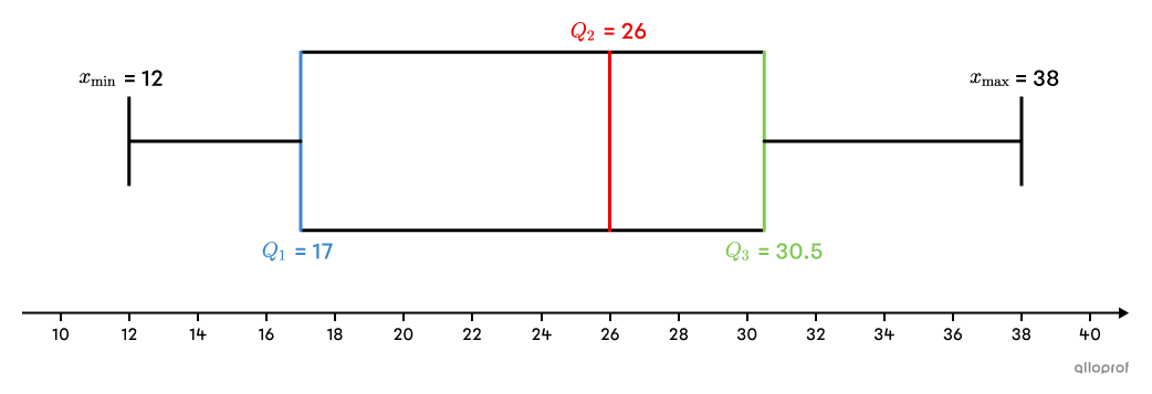
It is not necessary to indicate the minimum, maximum and quartile values on the plot, since there is always a number line.
The following is an example of a distribution where there is an outlier:
Here are the grades obtained by students in Group 301 on a mathematics exam:
|63,| |96,| |60,| |84,| |52,| |68,| |70,| |12,| |98,| |75,| |72,| |65,| |60,| |74,| |92,| |76,| |94,| |68,| |65,| |88,| |76,| |80|
Construct the box and whisker plot for this distribution.
The number of data in a quarter should not be confused with the concentration of data in that same quarter.
Each quarter of a box and whisker plot contains about |25\%| of the data in the distribution it represents.
In a box and whisker plot, a quarter that is longer than the others indicates that the data are more dispersed. Conversely, a quarter that is shorter than the others indicates that the data are more concentrated.
With the intention of opening a new sportswear store, a company interviewed a sample of the population about how much each individual would be willing to pay for a high-quality piece of clothing.
To facilitate the interpretation of the data collected, the following box and whisker plot is constructed:
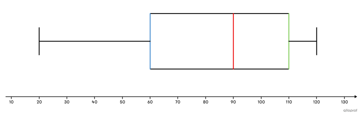
Looking at this diagram, we can conclude that approximately |75\%| of people, that is, those in the 2nd, 3rd and 4th quarters, are prepared to pay between |\$ 60| and |\$ 120| for a top quality garment.
In addition, we note that the people in the 4th quarter are prepared to pay a price within a very narrow range (between |\$ 110| and |\$ 120|), whereas the people in the 1st quarter are prepared to pay a price within a very wide range (between |\$ 20| and |\$ 60|).
The future company will have to keep this information in mind in order not to sell its products at prices that are too high or too low.
It is possible to convert quarters to percentile ranks and quartiles to percentiles.
The 1st quarter contains the percentile ranks 1 to 25.
The 2nd quarter contains the percentile ranks 26 to 50.
The 3rd quarter contains the percentile ranks 51 to 75.
The 4th quarter contains the percentile ranks 76 to 100.
The 1st quartile |(Q_1)| corresponds to the 25th percentile |(C_{25}).|
The median |(Q_2)| corresponds to the 50th percentile |(C_{50}).|
The 3rd quartile|(Q_3)| corresponds to the 75th percentile |(C_{75}).|
When comparing box and whisker plots, first compare the medians |(Q_2)| and then compare the lengths of the whiskers (1st and 4th quarters) and the lengths of the boxes (2nd and 3rd quarters) to get an idea of the symmetry and dispersion of each distribution.
Here is an example of interpreting and comparing 2 box and whisker plots.
Serge is the manager of the shoe department in a sports equipment shop. To compare the performance of his two employees, Karine and Eric, he records their sales every day over a 30-day period. From the data he collects, Serge creates the following 2 box and whisker plots.
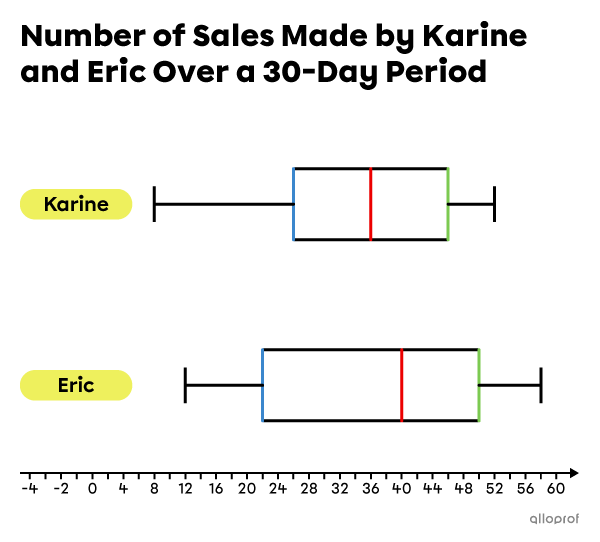
a) Who had the fewest number of sales in one day?
b) Who is the most consistent in terms of sales?
c) Considering their respective |15| best days, who made the most sales?
d) Did Karine necessarily make a day with |36| sales?
e) For how many days did Eric make between |22| and |40| sales per day?