Subjects
Grades
A bar graph presents the results of a survey using bars.
For example:
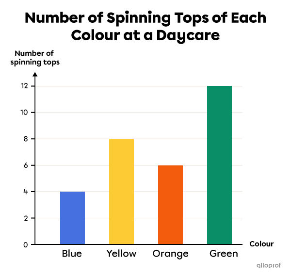
A bar graph always has a title that presents the subject of a survey.
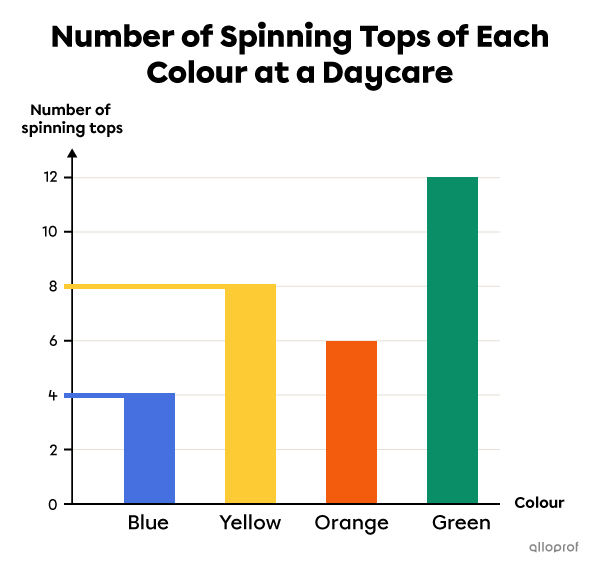
The title indicates that this bar graph represents the number of spinning tops in each colour at a daycare.
A bar graph has 2 axes: a horizontal axis and a vertical axis. Each axis must have a label to indicate what it represents.
In this graph, the horizontal axis represents the colour of the spinning tops. The vertical axis represents the number of spinning tops.
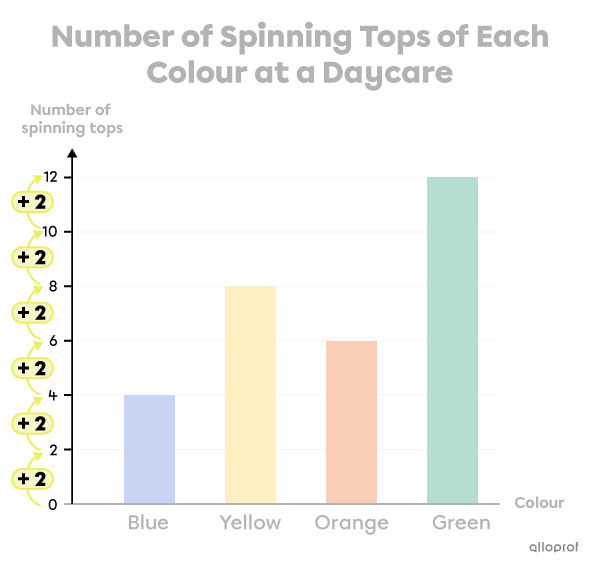
The scale on the vertical axis has equal intervals.
The interval between the numbers on the vertical axis is +2.
In a bar graph, the data (results) are represented using bars. The number associated with the height of each bar indicates the amount of data in each category.
The height of the blue bar is aligned with the number 4 on the vertical axis. So, there are 4 blue spinning tops.
The height of the yellow bar is aligned with the number 8 on the vertical axis. So, there are 8 yellow spinning tops.
To interpret a bar graph, analyze each part of the graph while keeping in mind the question asked.
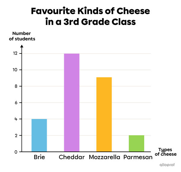
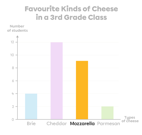
How many students prefer mozzarella cheese?
|  |
| 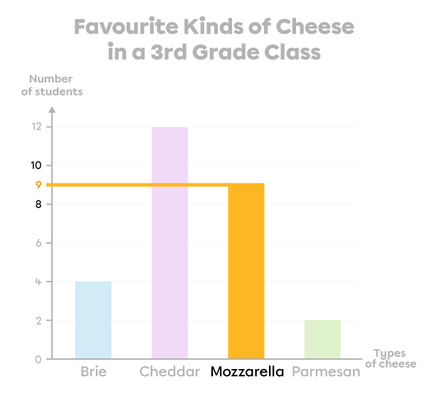 |
9 students prefer mozzarella cheese.
How many students are there in this 3rd grade class?

| 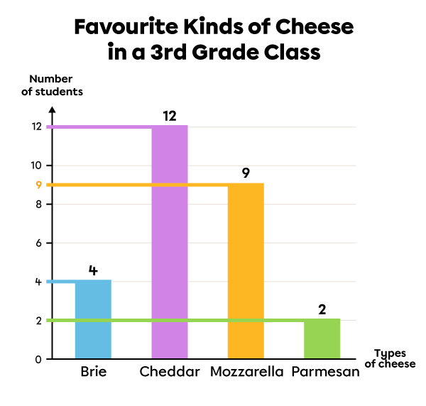 |
| 4 + 12 + 9 + 2 = 27 |
There are 27 students in this class.