Subjects
Grades
A bar graph presents the results of a survey using bars.
For example:
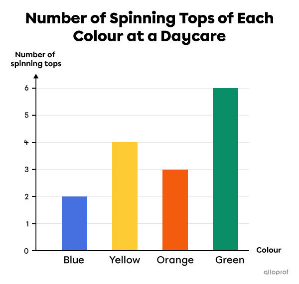
A bar graph always has a title that presents the subject of the survey.
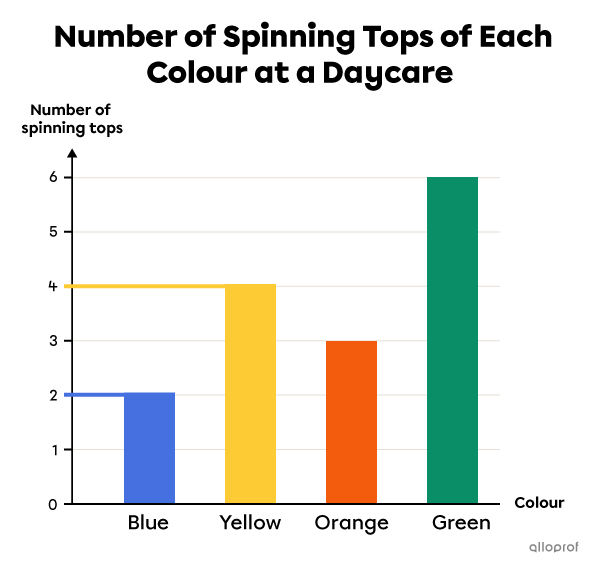
The title shows that this bar graph represents the number of spinning tops of each colour at a daycare.
A bar graph has 2 axes: a horizontal axis and a vertical axis. Each axis must have a label to indicate what it represents.
In this graph, the horizontal axis (in red) represents the colour of the spinning tops. The vertical axis (in blue) represents the number of spinning tops.
In a bar graph, the data (results) are illustrated using bars. The number associated with the height of the bar shows the amount of data in each category.
The height of the blue bar reaches the number 2 on the vertical axis. This indicates that there are 2 blue spinning tops.
The height of the yellow bar reaches the number 4 on the vertical axis. This indicates that there are 4 yellow spinning tops.